

- Naruto Rasengan Guide - June 18, 2022
- Naruto Sage Mode Explained - June 9, 2022
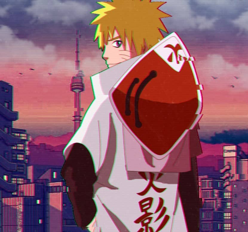
- Naruto Aesthetic Explained - May 18, 2022
In the Fall of 1999, one of the most significant entries to the Shonen (targeted for the young male audience) genre burst into the scene in the form of Masashi Kishimoto sensei’s Naruto. However, this international wonder ended its miraculous fifteen-year run in the Fall of 2014, totaling 700 thrilling chapters in 72 volumes.
The series sequel Boruto still carries its “Will of Fire” as it continues to turn the mystical action-packed world of Naruto. A story that aged from one generation of readers to the next.
The world of Nauro is one filled with several nuances and details for its keen-eyed viewers to pick up on. Having done my fair share of deep dives within my indulgence for the series, I am only so fortunate to have been part of this eclectically diverse and brilliant fandom that has grown the Japanese sequel to a pop-culture giant the series aired.
Hoping to now also contribute to this community, I’ll be mapping out my insights from my nearly two decades of following its publication to broaden my appreciation for the long-lived series.
The Author and His Inspirations
Kishimoto began his love for drawing very early on; he would later site in interviews that he drew a lot of inspiration from Takehiko Inoue (Slam Dunk), Katsuhiro Otomo (Akira), and most notably Akira Toriyama (Dragon Ball).
Taking inspiration from these authors was the first of many steps to Naruto’s creation. Aside from this, Kishimoto notably enjoys action drama films; influence from his love of these films can be seen throughout his vivid and anatomically accurate fight scenes that later would become one of the many reasons I became so engrossed with the series.
He would later go on to attribute his series’ runaway success beyond borders to Hiroyuki Okiura’s sci-fi fantasy “Jin-Roh: The Wolf Brigade,” Koji Kiriyama’s ninja tale, “Ninku,” and Masamune Shirow’s era-defining cyberpunk tale “Ghost in the Shell.” Kishimoto notes these authors’ success overseas and his adaptation of concepts he enjoyed from these series as what propelled his own creation’s international success.
In an interview with the French publisher of Naruto: Kana, I discovered that the character of Naruto and, by extension, the world, and story of Naruto at large was primarily brought about by the author’s childhood. In his interview, he spoke of how interactions with his friends from broken families and his empathy toward their situation impacted him to make it one of the core themes of his work.
More so than that, it was his close relationship with an orphaned old friend where he found his sensitivity toward familiar woes even in his youth. Another central theme of Naruto was formed around the concept of bonds beyond blood.
This theme was also inspired by Kishimoto’s upbringing in Okayama. Where he grew up, there exists a tradition of gatherings called “Kumi,” roughly translated as a clan or group where even non-blood-related members treat each other like they do family.
As for the titular character of Naruto, an interview with the LA Times has the author admitting that he got the idea to model Naruto as a version of his childhood. They were both poor-performing students; he wanted Naruto to be different in that he didn’t dwell on his current state and sought constant improvement until he was brought to the forefront of the story as the hero.
It is perhaps Kishimoto’s great observations about the world, as well as his deep connection to the roots of his formative years, that drives the author’s ability to blend real-life issues into his work seamlessly.
Although Naruto was a bonafide masterpiece, Kishimoto couldn’t do it alone. Behind the master was a cast of talent-filled assistants and the incredible studio Pierrot that catapulted Naruto to where it is today.
In an interview with Shonen Jump magazine, the Naruto author had nothing but praises and assurances for one of his seasoned assistants Mikio Ikemoto who he credits as the designer of famous Naruto characters Zabuza and Haku. Much like Naruto, his strongly created bonds with his staff and colleagues would contribute to Naruto’s miraculous generational run.
The Specificity of the Art Style
As a Japanese “comic,” the Manga is known for its monochromatic presentation style. Outside of color or title spreads that we can see in the occasional magazine or Manga volume highlight, alongside the right to the left reading orientation of the Japanese graphic novel is what makes Manga unique to its American (Comic), Korean (Manhwa), and Chinese (Manhua) counterparts.
However, what pushed Mashi Kishimoto’s Naruto into becoming a mainstay or flagship title within Shueisha’s Shonen Jump is the action-filled, fantastical storytelling and style that Naruto possessed throughout its inception.
Speaking more about Kishimoto’s stylistic choices during his serialization, I would pinpoint how he spaces his panels, utilizes creative points of view, and the fantastic two-page spread he draws on top of the aforementioned fight scenes as his stylistic strengths.
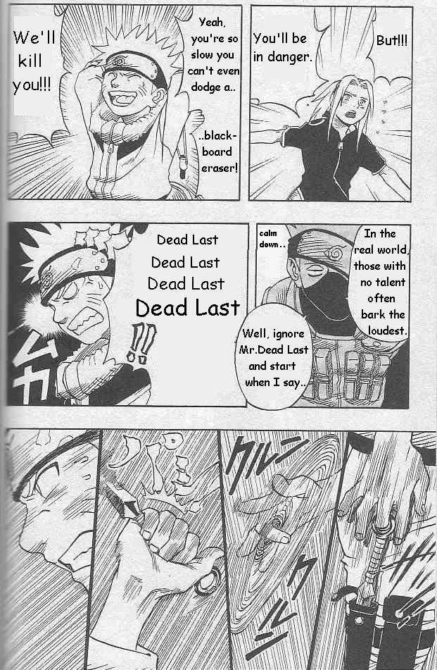
The author of Naruto creates unique frame-by-frame moments, not only through the eye-catching and explosive scenes but even in the more subtle moments. This can be seen very early on when Kakashi Hatake first fights Team 7 in the “bell test” to see if they are fit to become Genins of Konoha.
Here you can still see the early days of Kishomoto’s panel arrangement as he compiles 4-Komas (Yonkoma: A comic strip format where four panels are placed in succession) together to form a whole page. Even though it can be passed off as your typical 4-Koma, Kishimoto is still able to inject the fluid motion of Naruto pulling out a kunai wearing a battle-ready face.
Before a similar 4-Koma, the following page depicts Kakashi subjugating his soon-to-be student’s act of aggression with ease, leaving the recently battle-readied Naruto distraught. This simple juxtaposition shows Kishimoto’s stylistic brilliance right out of the get-go.
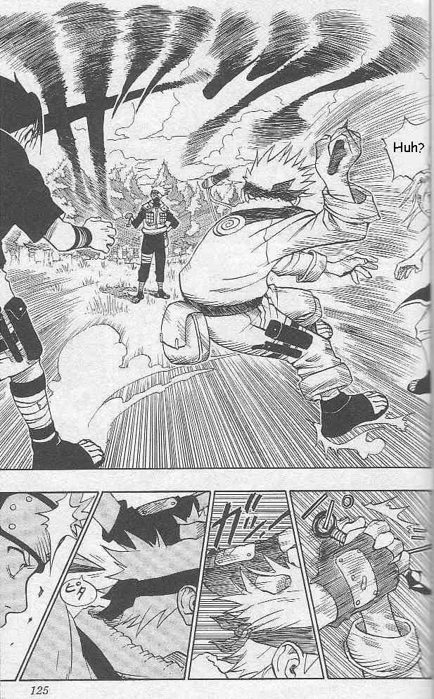
One of my earliest memories of Kishimoto experimenting with panel formats would be when Naruto and Sasuke team up to fight Haku (Volume 3 or Episode 12), wherein Haku assumedly kills Sasuke. Although we later know that to be false, Kishimoto spared no expense in allowing us to feel the pain and anger that Naruto felt at that moment.
The jarring two-panel splits depict an enraged naruto hovering over Sasuke’s unconscious body, vowing to kill Haku; this scene dominates most of the page, leaving a smaller panel below showing Haku’s shock even while his face was concealed by the mask she wore. The slight diagonal split also accentuates the force Naruto is unleashing at that moment as the panels break away from their neat square or rectangle shapes.
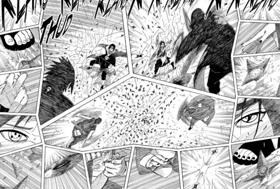
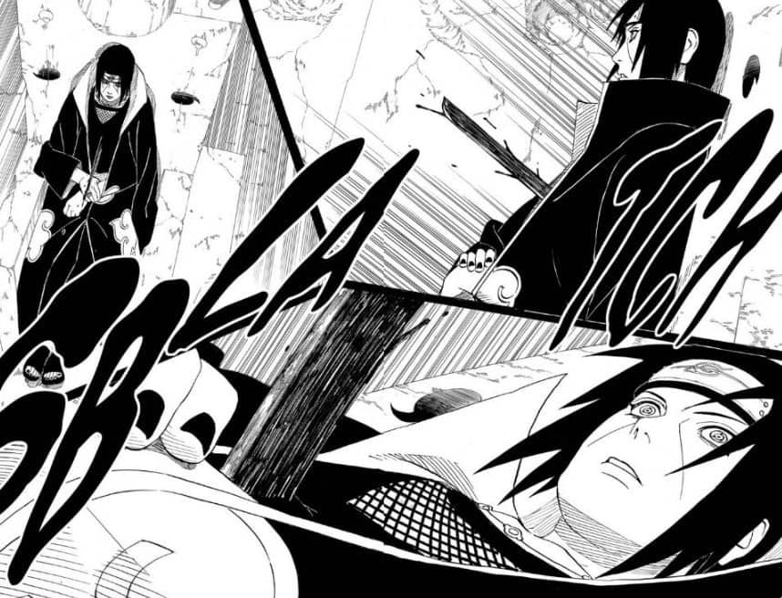
The organization of Kishomotos panels later evolves into being able to depict multiple facets of a single story beat in the confines of one to two pages. For example, in quite possibly my favorite moment in Naruto, where Sasuke fights Itachi (Manga Volume 42 & 43, Episode 134 to 143), in the very beginning moments of the fight, two scenes stand out to me as examples of Kishimoto’s mastery over his own art form.
The first would be when Itachi was presumably stabbed by Sasuke. Here he splits a magnificent two-page spread into three panels, breaking away from the 4-Koma format to depict the moment from three different angles, with the panels in focus showing a close-up of the shock in Itachi’s face.
Another would be when the fight breaks passed the Genjustsu or illusory phase, and the two unleash a flurry of shuriken and kunai-based attacks. Here Kishimoto splits the yet another two-page spread and has three center panels framed by several smaller ones depicting the fluid motions and facial expressions with the smaller panels while offering the readers three different perspective shots of the actual exchange. Through these scenes and several others, the author of Naruto showcases his exquisite takes on how he approaches the angling of perspectives alongside his mastery over two page spreads to accentuate certain emotions or bring further emphasis to the gravity of the situation character or characters find themselves in. All these small nuances ultimately aid in his storytelling process.
The Trasformation of Naruto’s Art
As one of the longest-standing artists in the world of Manga, it is no surprise that Kishimoto’s art style adapted, evolved, and changed over time as all other great Mangaka’s crafts do. It can be said that his earlier works.
When he first started drawing, Kishimoto didn’t necessarily have the most uniform way of drawing, don’t get me wrong, it’s not as if the characters are indistinguishable; however, the earlier chapters of naruto definitely saw more minute detail deviances, and in my opinion, the art style then was to me somewhat blocky and at times overly detailed.
The first transition slowly became more and more noticeable around 2003 or volume 16 or 17 onwards, when I noticed the adaptation Kishomoto slowly took to simplifying his work.
In this “simplification,” his work looked more refined and slowly but surely mimicked what the audience enjoyed in the anime. However, the cross that one bares as a long-time serialized author, regardless of caliber, is the risk of burnout or fatigue, as the later the series ran, the more streamlined his artwork began to become.
This streamlined nature became most apparent to me during the final arc of Naruto, during the Great Ninja War, which spanned the last stretch of episodes and volumes for the series.
There are times it felt like there were just too much going on to hide the fact that fewer and fewer details were able to find their way to the final release of each chapter. However, I am by no means saying that the quality ever went as far as to have become inadequate.
I personally cannot begin to fathom the pressure and stress that comes with being a weekly serialized author regardless of aid. Be that as it may, no matter how much the quality of the work may have changed over time, they were still, to me, of a very high caliber.
Manga to Anime, Anime to Manga
There are a lot of fundamental nuances that come with adapting an anime to a manga. Many of them may seem general, but I’d like to talk about how this affected Naruto as an action Shonen in specificity. However, these effects and nuances can be seen throughout most literature when we talk about small or even big-screen adaptations.
Kishimoto, and by extension those he worked on the series with, be it on the Manga or Anime, can, in my opinion, be considered pioneers in pushing the envelope for the popularity of the now “general” and standard practices we see today.
As mentioned, Kishimoto himself even noticeably began to adapt the art of his popular serialization to its anime counterpart, regardless of the reason it made it so that I, as a watcher of the series, was able to smoothly transition to becoming a reader without there being a worry for a disconnect or any off-putting feelings I may have had if the art style stayed in its prior blocky, slightly deformed, or disproportioned style.
It ultimately allowed me to enjoy the Manga and the otherwise different aspects and details it brought to bringing this fantastic story to life.
Of course, the most noticeable difference in the aesthetic is the combat of it all. As mentioned, Kishimoto and his team do an excellent job portraying the fantastical action in Naruto through Manga format with the stylistic choices and technique Kishomoto puts into his employ. As an action Shonen, the series greatly benefited from its small-screen adaptations.
The often detail-oriented combat scenes explode to life in full color, frame by frame, fully paying homage to the author’s expertise in depicting anatomically correct action scenes.
However, regardless of what Naruto gained from its small-screen adaptation, there are aspects the manga retains that not even a perfect adaptation can copy. Such merits include the pacing and panel organization of Kishimoto, the sharper and more detailed expression often immortalized in said panels, as well as the ability for a manga readers to fully immerse themself in the details within the stillness of each image.
The argument for manga vs. anime has existed since the inception of adaptions. I’m not here to drive a wedge between those who loved the manga and not the anime or vice versa since both the manga and the anime benefited from each other.
The Details in Kishimoto’s Aesthetic Choices
I’ve spoken a lot about the uniqueness of the art that breathed life into Naruto, yet the illustrations or animation alone aren’t what solely make up the greatness of this series. I personally find the more minute and even, at times, intangible details and choices are what genuinely make Naruto a masterpiece in its own right.
When one talks about a Ninja or a Shinobi in the realistic sense, my mind will go to those sneaky individuals hidden in all black. So it’d come as no surprise that die-hard Shinobi fans would be nonplus about why kids in colorful jumpsuits and other crazy attires have slowly but surely become the modern representation of “Ninjas.”
Kishimoto says in the interview with French distributor Kana “It may seem obvious, but I wanted to distance myself away from the cliche ninja dressed in black on purpose.
I didn’t see any point in using an image that has been used countless times already. So I took the opposite direction. A little blond guy with a jumpsuit, and not even Japanese. I wanted my character to be stateless, like Akira Toriyama’s characters.
That was the basic idea.” (Kishimoto, 2018). By now, it should be pretty evident that Naruto is a fantastical, action-oriented fiction; however, despite Kishomoto’s claims to shy away from the” cliche,” there is quite an abundance of realism in the work of Kishimoto. For one, in a similar interview, the author attributes fashion magazines to be a source of inspiration for the clothing or fashion choices of the characters.
I often find his uncanny ability to incorporate fantasy into realism to be one of the more incredible selling points of the series, outside of the open-toed sandals that Kishimoto loves to draw, the general outfits of the everyday ninja with the forehead protector, and a variety of vests and guards are actually rather practical for combat use.
Kishimoto’s use of realism was even later pushed to the forefront during the Great Ninja War arc, where we see most of the main cast shift from their unique outfits to the stand combat attire prescribed by their respective villages. While on the topic of the forehead protectors, one other observation I noticed was how many symbols pay homage to words or things we find in real life.
The elemental nations of Fire, Earth, Water, Wind, and Lighting sport the Kanji of each respective term on the hats and mantles that the Kages wear and even in the elemental scrolls and techniques each Shinobi employs. To that extent, I theorize that the symbols used by each village, at the very least, draw inspiration from the ancient symbols that several Asian nations used as their alphabet in history.
To corroborate that theory symbol of the Uzumaki clan resembles the spiral of the Uzumaki food in Japanese cuisine. The word Uchiha is seemingly another way to write (Uchiwa), which means a fan.
Lastly, and perhaps my favorite intangible that Kishimoto employs, is the way he utilizes flashbacks. I personally find the trope of flashbacks to be overplayed or overused to shoehorn lore or narrative of some kind.
Although Naruto is no exception to using flashbacks this way, two of the most iconic fights in Naruto that being Obito vs. Kakashi (Volume 66, Episode 375) as well as the final fight between Naruto and Sasuke (Volume 72, Episode 476) has the author seamlessly weaving flashbacks into the battles, perhaps to show how history often repeats itself, if not to bring more emotional and sentimental weight and context to the scene that’s playing out.
This is a clever use of an otherwise overused trope that brings yet another fantastic element to these fight scenes on top of what they already offer.
FAQs
Question: Does Kishimoto still draw/write for Boruto?
Answer: After the end of Naruto, Kishimoto chose to assist and oversee the production of Boruto. However, he decided not to play a significant part in it. Instead, he entrusted the series to long-time assistant and fellow Mangaka Mikio Ikemoto as well as Ukyo Kodachi; however, as of chapter 52 of the manga, Kishimoto has returned as the writer for Boruto, with Ikemoto sensei remaining as the illustrator.
Question: How has the aesthetic evolved now in Boruto?
Answer: In my opinion, I think that the aesthetic within the world has modernized. The presence of gadgets and even the monorail was something I couldn’t entirely wrap my head around. However, aside from the in-world modernization, the artistic aesthetic has largely remained similar.
Question: What’s one thing that remained prevalent even in Boruto?
Answer: Short answer? Eyes. Long answer? Between the Sharingan, Mangekyou Sharingan, Byakugan, Rinnegan, Rinesharingan, and the eyes that simply caused aesthetic changes such as the Sage mode eyes or the different patterned eyes which Jinjuriki’s of all kinds sported. The vast collection of differing eyes remains relevant even till Boruto with the introduction of the Tenseigan. Yet, another eye power that threatens the already steep power creep in the series.
Naruto Aesthetic: Conclusion
The world of Naruto is one of many that I’ve had the pleasure of growing up alongside. Having the chance to do this deep dive and analysis over what made it so memorable was both a wonderful trip down memory lane and one that was truly enlightening.
As I finish this piece, I’ve grown in my fascination and appreciation for Kishimoto’s Naruto and the entire process of coming up with a full-blown manga, as several Mangakas, aspiring or seasoned, continue to share their worlds and stories with us.